Campaign Builder for Blaze Ecom
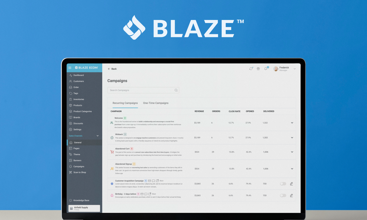
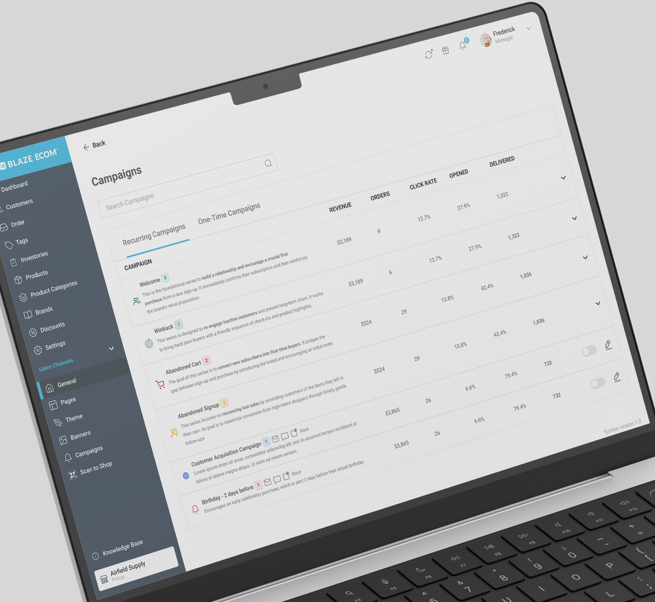
This project focuses on the campaign management section of a cannabis e-commerce dashboard. It helps store owners create and track marketing campaigns in one place.
OVERVIEW
This project focuses on the campaign management section of Blaze ECOM, a cannabis e-commerce admin platform. Store owners needed a way to create, manage, and monitor marketing campaigns — from welcome sequences to abandoned cart flows — directly from their dashboard. My role covered the full design process: from interpreting the product brief and mapping user flows, to building the final interface and preparing assets for handoff. The research and problem discovery phases were led by the product team; I was brought in from the briefing stage, responsible for translating those insights into a functional and intuitive experience.
CONTEXT & RESEARCH
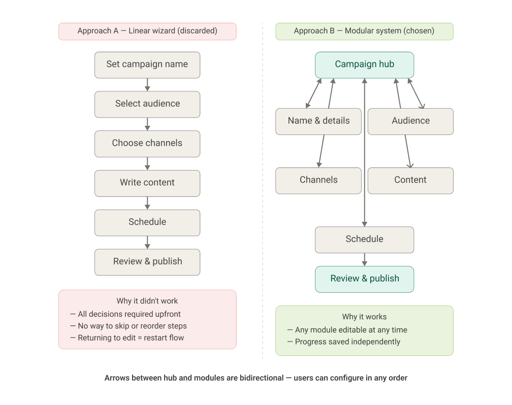
The product team conducted discovery before I joined the project. Based on the brief I received, the main findings were: • Store owners were spending excessive time creating campaigns due to a rigid, step-by-step flow that required all decisions upfront. • A significant portion of users abandoned the campaign builder before publishing, often because they couldn't easily revisit earlier choices. • The existing interface treated all campaign types the same way, even though recurring and one-time campaigns have very different configuration needs. My starting point was this briefing. From there, I ran a competitive analysis of tools like Klaviyo, Mailchimp, and ActiveCampaign to understand common patterns and identify where I could take a different approach.
THE CHALLENGE
The core challenge was reducing friction in the campaign creation process without taking away flexibility. Store owners needed to move fast but the existing flow forced every decision upfront, in a fixed order, with no easy way to go back. The goal was to redesign this experience so users could build campaigns progressively, at their own pace.
THE IDEA
The idea came from questioning the default assumption of campaign builders: that users need to be guided step by step. Instead, I explored what it would look like to treat a campaign as a set of independent modules, each configurable on its own, in any order, giving users structure without forcing a rigid sequence.
MAIN FOCUS
• Reducing unnecessary steps • Making the flow adaptable instead of linear • Keeping key decisions visible throughout the process
OUTCOME
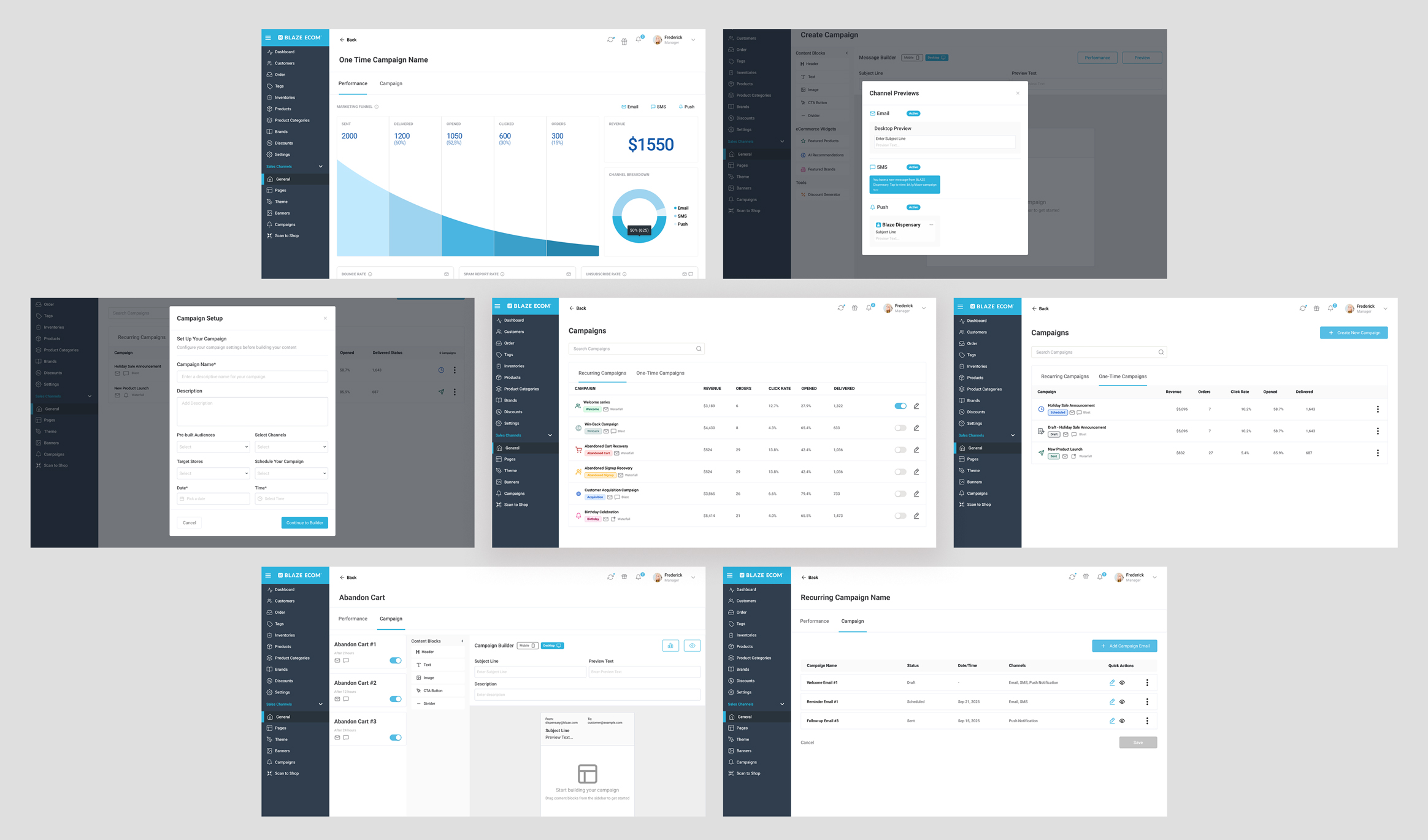
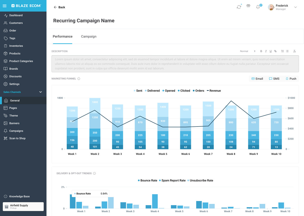
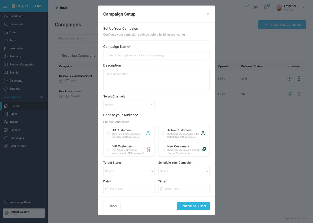
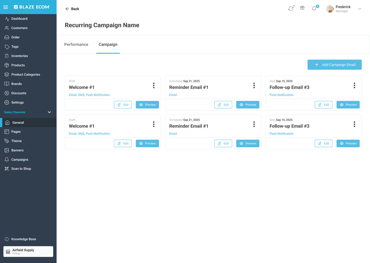
The final solution is a modular campaign builder that separates the creation flow into independent, reconfigurable sections, allowing store owners to build campaigns at their own pace without losing progress or context. As a designer who joined after the research phase, I didn't have direct access to post-launch performance data. However, the success criteria aligned with the product team from the start were clear, and if I were to define how I'd measure this solution's impact, I would track three things: • Task Completion Rate: Monitoring the percentage of users who complete the campaign creation flow to see if we successfully decreased drop-off before publishing. • Time to Publish: Tracking the average time from campaign creation to first publish to ensure we reduced the time users spent configuring a campaign. • Support Ticket Volume: Measuring the reduction in support contacts related to campaign management to confirm the interface is more intuitive and less frustrating. These were the exact problems the brief pointed to, and they are the right indicators to know whether the design actually solved them.
LEARNINGS
Working from a PM brief, without direct access to user research, pushed me to ask better questions before opening Figma. I learned to treat the briefing as a starting point, not a spec: map the assumptions, identify the gaps, and align on what we actually knew versus what we were betting on. If I were to revisit this project, I would have pushed for at least one round of usability testing on the campaign creation flow before locking the modular structure. The concept made sense in theory, but I never got the chance to watch a real store owner navigate it from scratch, which is always where the most important insights show up. The biggest takeaway: define success criteria at the start of the process, not the end. Designing without a clear metric is designing without a target. And without a target, it's hard to know when the work is actually done.
Other projects

Blaze Product Page Redesign
The product page created confusion, making it difficult for users to quickly understand the offerings. A new structure made it easy to find products.
Kore.Builders
A specialized platform for the private capital market, designed to empower developers and founders with the infrastructure needed to build and launch financial products.