Blaze Product Page Redesign

The product page created confusion, making it difficult for users to quickly understand the offerings. A new structure made it easy to find products.

Role
UX/UI Designer
Industry
E-commerce
Duration
1 month
Blaze Product Page Redesign
OVERVIEW

WHERE THE EXPERIENCE BREAKS

The existing product page for our cannabis e-commerce platform lacked the clarity needed for an informed purchase. Users were overwhelmed by technical jargon, struggled to identify products suited to their experience level, and faced friction when attempting to purchase in bulk. The redesign aims to better communicate this value by simplifying how information is presented and guiding users more effectively through the product experience.

01

RESEARCH AND INSIGHTS

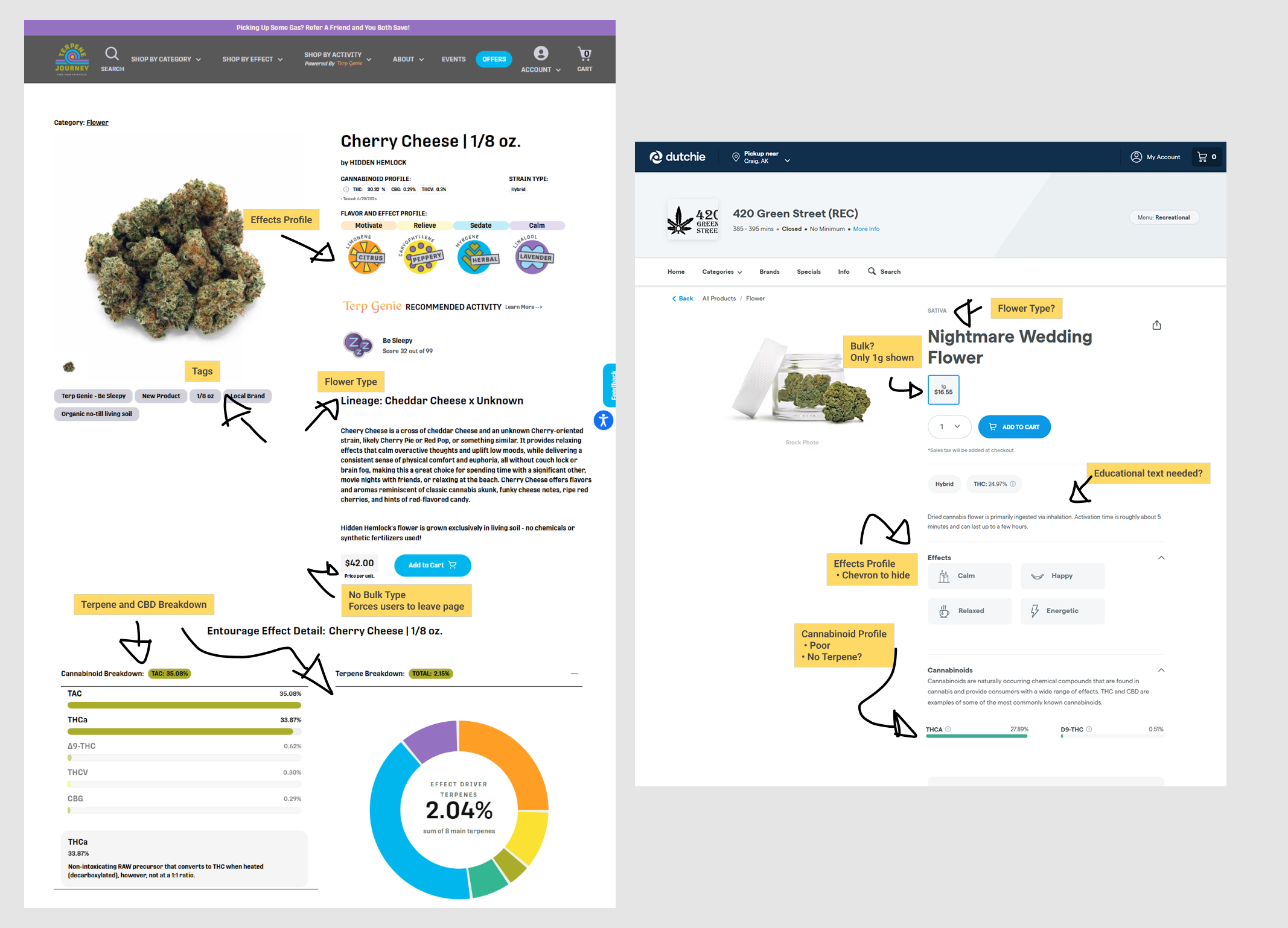
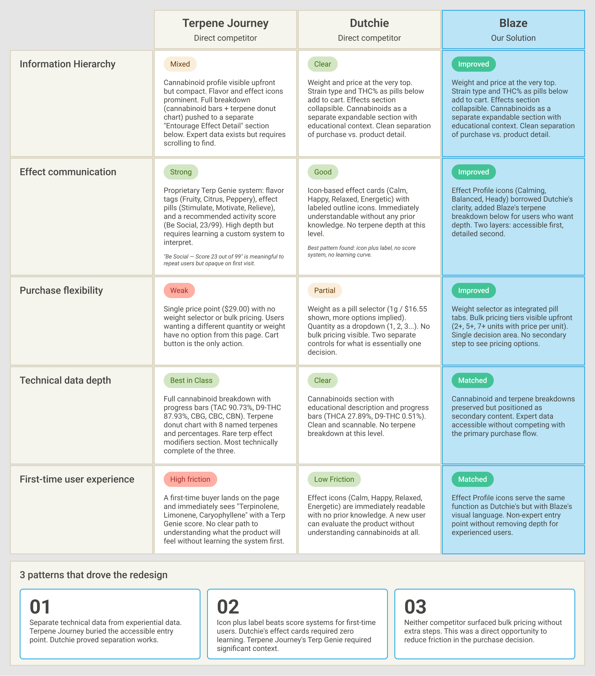
Research and Insights detail 1
Research and Insights detail 2

Problem:

Information Overload:
Technical data (THC/CBD/Terpenes) was difficult to scan.
Lack of Effect Context:
Users did not understand how a product would physically or mentally impact them.
Purchasing Rigidity:
No clear, intuitive way to select different weights or bulk quantities.
Sensory Ambiguity:
Lack of clarity on flavors and aromatic profiles.

Goal:

Cognitive Ease:
Helping users understand how a product will affect them without requiring prior cannabis knowledge.
Data Scannability:
Structuring data to be scannable for both novice and expert users.
Purchasing Rigidity:
Adding a dynamic weight selector to facilitate larger orders.
Sensory Clarity:
Surfacing flavor and terpene profiles in a scannable, human-readable format.
02

WIREFRAMES

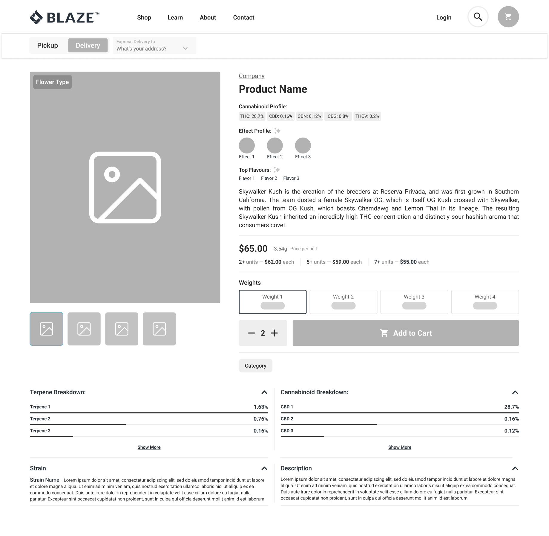
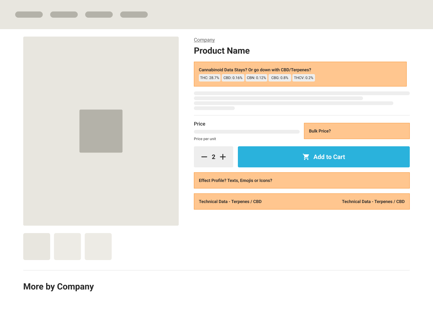
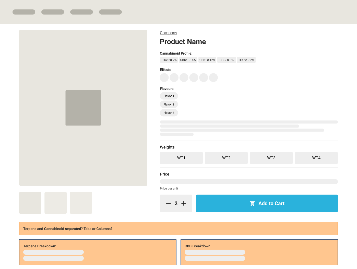
I created low-fidelity wireframes to explore key flows and functionality. Early prototypes helped refine interactions, and as the design progressed, I increased fidelity to shape the final experience.
Wireframes detail 1
Wireframes detail 2
Wireframes
03

BEFORE/AFTER

Before

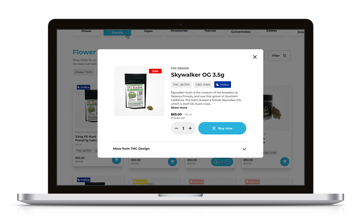
The original interface acted more as a catalog than a decision-making tool.
Information Silos:
Critical data like effects and flavor profiles were missing, forcing users to search elsewhere.
Static Purchasing:
The interface lacked flexibility for users wanting to buy in bulk or select different weights, leading to cart abandonment.
Educational Gap:
Users felt lost regarding the "experience" level of the product, as the UI offered no guidance on strain characteristics.
Visual Noise:
Cluttered layout with poor information hierarchy made it difficult to scan technical details.
Before

After

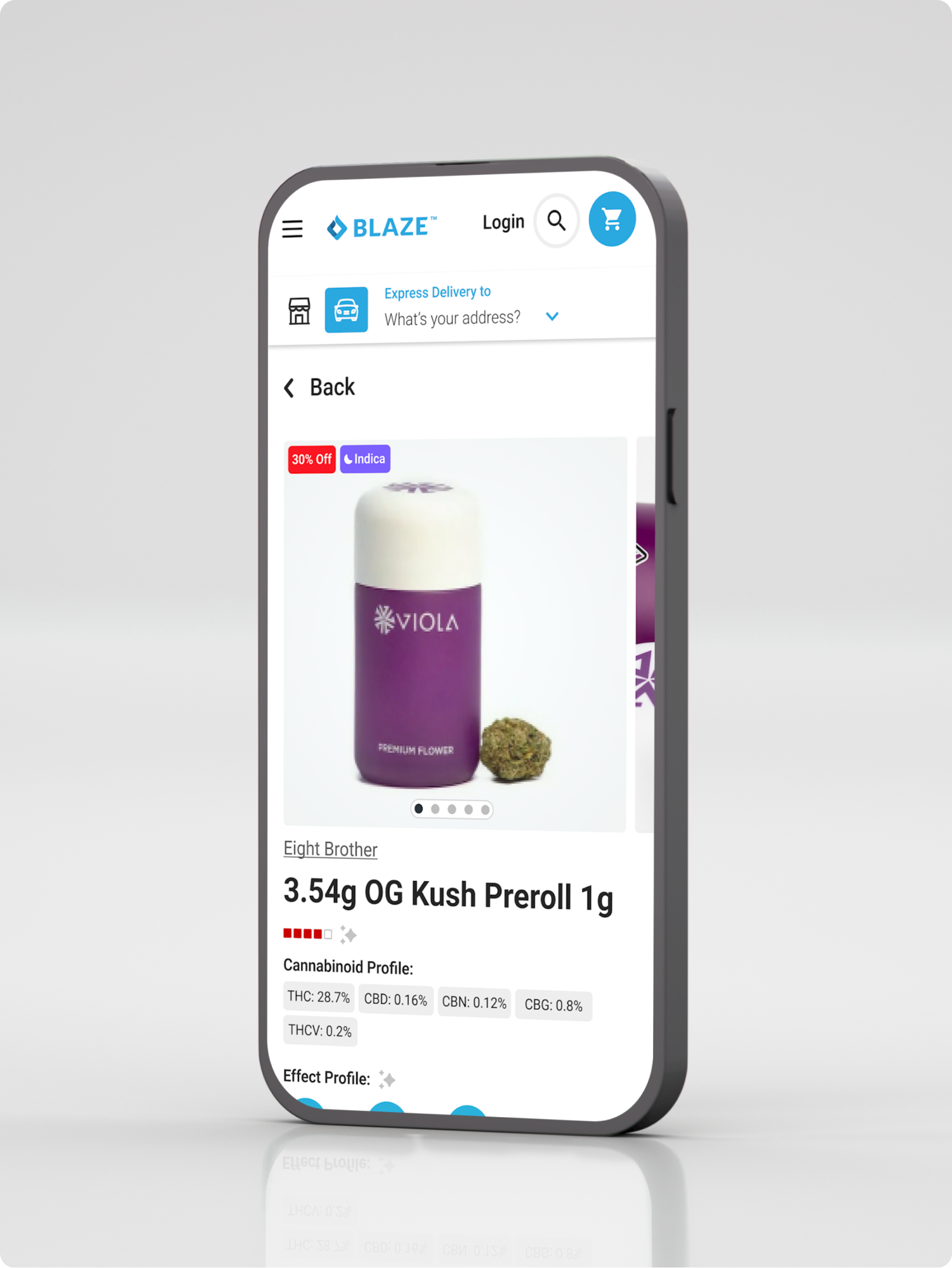
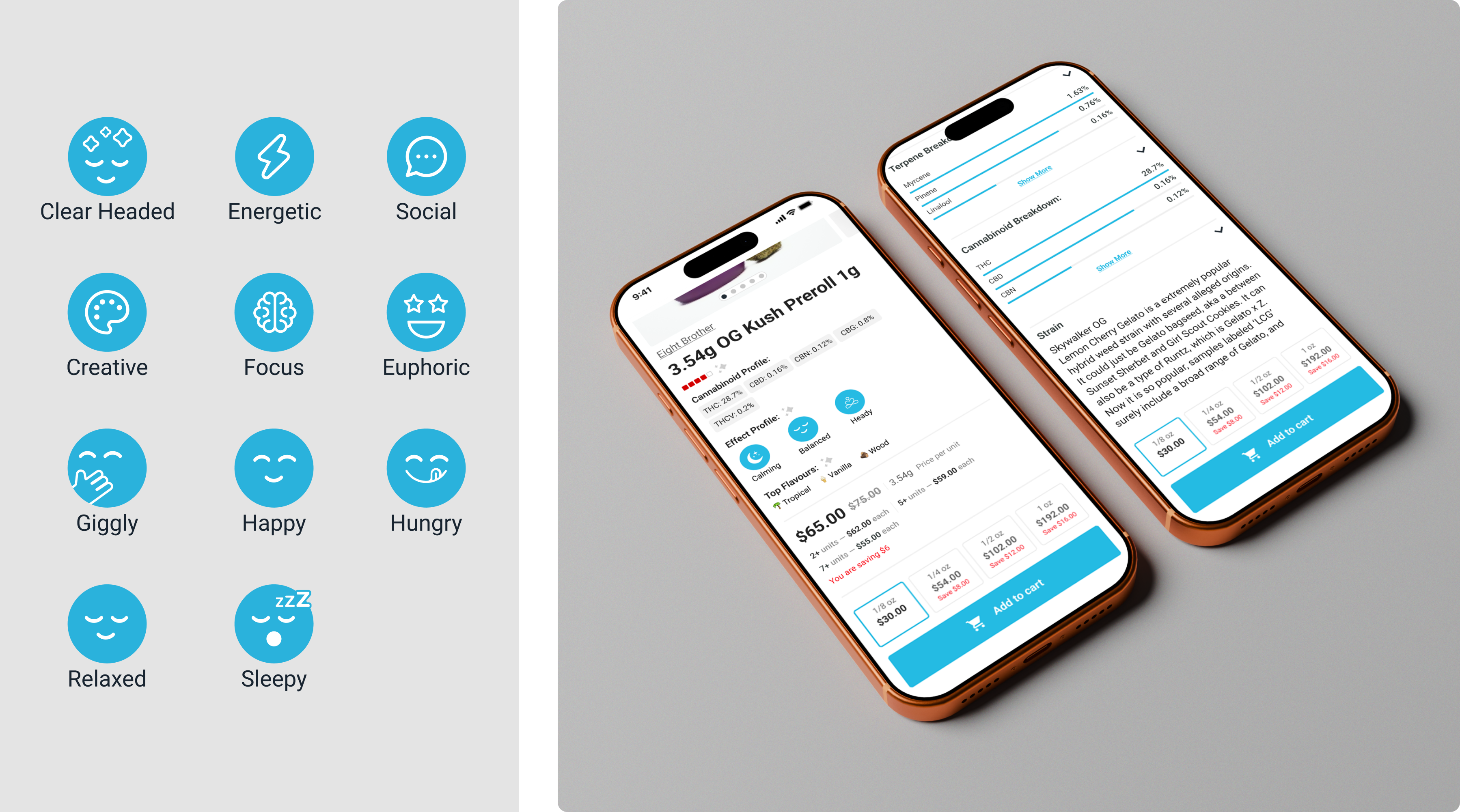
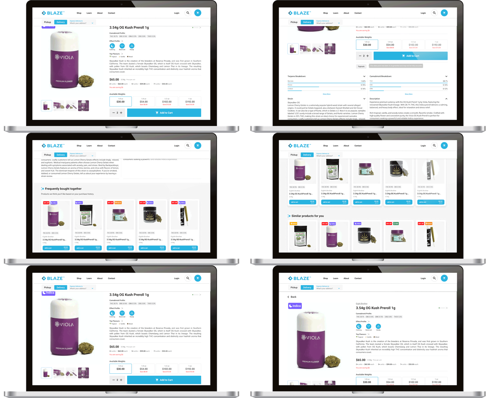
The redesigned interface empowers the user by transforming complex data into intuitive, actionable insights.
Contextual Guidance:
Integrated Effect Profile icons (Calming, Balanced, Heady) allow users to instantly align the product with their desired experience.
Dynamic Flexibility:
A new Available Weights selector streamlines the purchase flow, enabling easy selection from 1/8 oz to 1 oz without friction.
Sensory Transparency:
Added Top Flavours and a detailed Terpene Breakdown to humanize the product and build consumer trust.
Hierarchical Clarity:
Optimized whitespace and typography create a clean, scannable layout, allowing users to find technical data (THC/CBD) or product descriptions at a glance.
After
04

DESIGN SOLUTIONS

Contextual Guidance:
Integrated Effect Profile icons (Calming, Balanced, Heady) allow users to instantly align the product with their desired experience.
Dynamic Flexibility:
A new Available Weights selector streamlines the purchase flow, enabling easy selection from 1/8 oz to 1 oz without friction.
Sensory Transparency:
Added Top Flavours and a detailed Terpene Breakdown to humanize the product and build consumer trust.
Hierarchical Clarity:
Optimized whitespace and typography create a clean, scannable layout, allowing users to find technical data (THC/CBD) or product descriptions at a glance.
Design Solution
Design Solution